
Is OnePlus Leaving the US? Analyzing the Future of the Brand
The Evolution and Current Standing of OnePlus When OnePlus first emerged onto the global stage in 2014, it arrived with a clear, disruptive…
For years, users have watched the Windows search interface gradually evolve from a precise, local utility into an expansive hub for web suggestions, promotional content, and algorithmic recommendations. While Microsoft initially envisioned this integration as a way to bridge the gap between local files and the vast information on the internet, the result often felt overwhelming. Instead of helping users launch applications or locate documents quickly, the search bar frequently became a source of digital noise, pushing news headlines and marketplace advertisements into the peripheral vision of anyone just trying to navigate their own computer. This shift toward a cluttered interface turned what should have been a frictionless experience into a distracted one, leaving many power users and casual enthusiasts alike longing for a return to the minimalist functionality that defined earlier versions of the operating system.
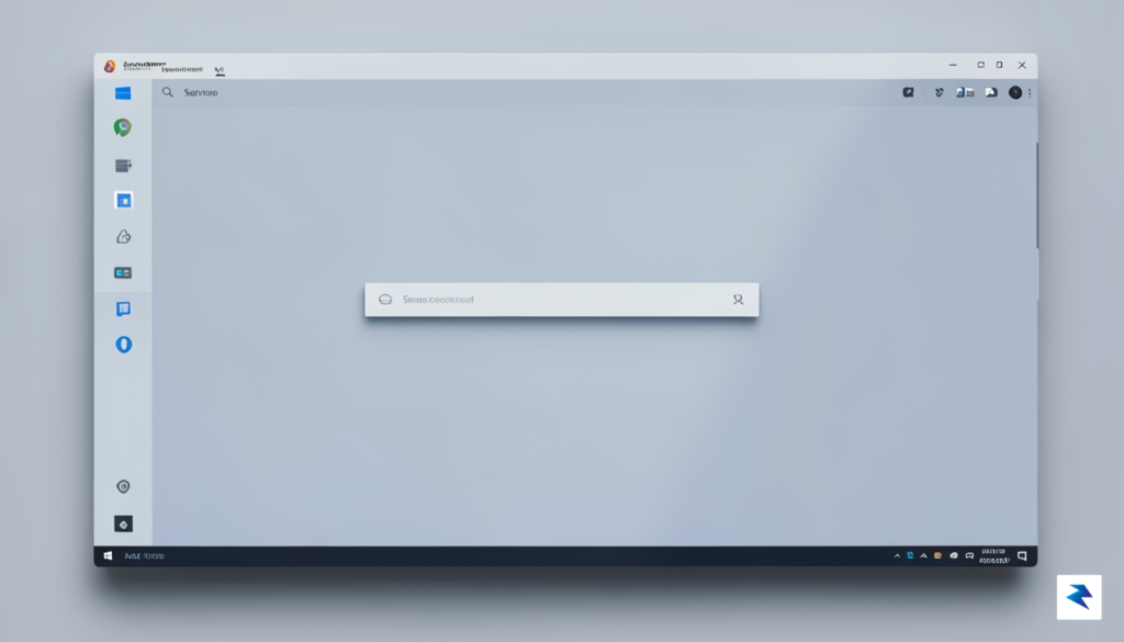
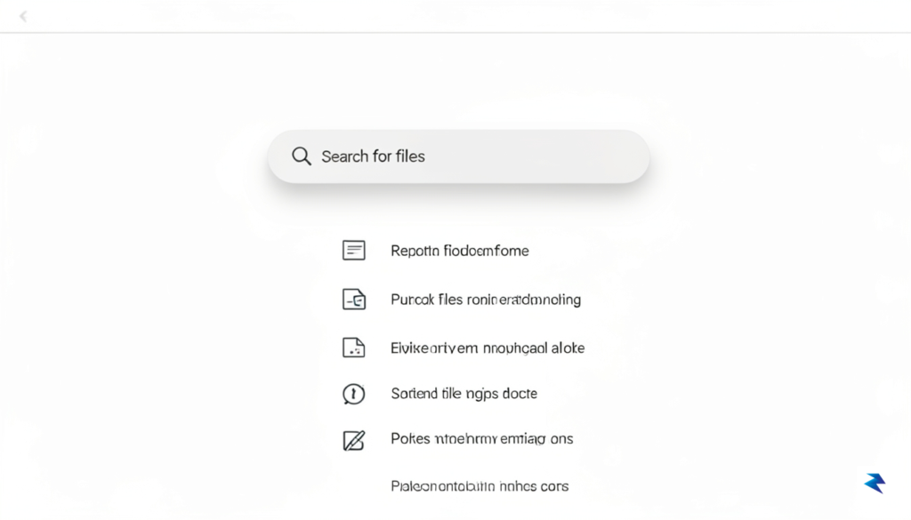
In a promising reversal of this trend, Microsoft has recently begun testing a significantly decluttered version of the Windows 11 search menu within its Experimental release channels. By stripping away the promotional elements and the persistent “recommended” sections that have become hallmarks of the modern Windows experience, developers are effectively prioritizing user intent over advertising real estate. This experimental iteration treats the search bar as a tool for navigation rather than a platform for discovery, focusing strictly on local applications, documents, and settings. It is a subtle but profound acknowledgment that the primary value of a desktop operating system lies in its reliability and speed, not its ability to serve content that the user never requested in the first place.
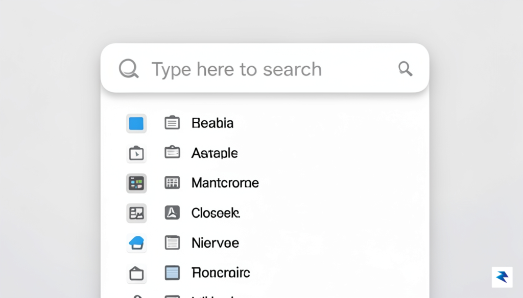
By prioritizing the core utility of local search, Microsoft is signaling a pivot toward a more streamlined, user-centric interface that values productivity over promotional noise.
The significance of this testing phase cannot be overstated, as it represents a potential turning point in the design philosophy of the Windows ecosystem. For the average user, this change promises a more predictable interface where clicking the search icon returns only what is necessary, effectively removing the cognitive load of filtering through sponsored content. If these tests translate into a standard feature update, it will signal that Microsoft is finally listening to the feedback of a community that has grown weary of the “bloatware” feel that has permeated recent updates. Ultimately, this move toward a cleaner, more focused search experience could restore the sense of ownership and control that long-time users have been seeking, proving that a modern operating system can remain powerful without sacrificing its core simplicity.
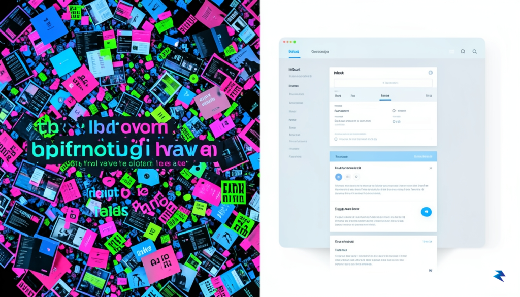
For years, the Windows search menu served as a reliable, high-speed utility designed for a singular purpose: locating local files, applications, and settings on a user’s machine. However, as Microsoft expanded the scope of this interface, it inadvertently transformed a productivity tool into a cluttered billboard. The integration of “Search Highlights,” web-based advertisements, and promotional suggestions for Microsoft 365 services disrupted the user workflow, turning a quick search for a document into an intrusive marketing experience. This evolution created a significant friction point for power users and casual consumers alike, who viewed the operating system as a platform for their work rather than a medium for unsolicited advertising.
The mounting frustration stems from a fundamental conflict between user experience and monetization strategies. While Microsoft sought to leverage the high visibility of the Windows search bar to drive engagement with its broader ecosystem, the sheer volume of “fluff” compromised the perceived reliability of the tool itself. When users search for a file on their own hard drive, they expect an immediate, distraction-free result; when that result is buried under trending topics, sponsored links, or prompts to sign up for cloud services, the operating system feels less like an assistant and more like a vendor. This perceived degradation of the interface has led to a measurable decline in user satisfaction, with many long-time Windows loyalists expressing vocal disappointment across tech forums and feedback channels.
The success of an operating system relies on the trust between the developer and the user; when utility is sacrificed for ad exposure, that trust is fundamentally undermined.
Microsoft’s decision to reconsider this approach suggests a strategic pivot toward reclaiming that lost trust. By testing cleaner, more focused search interfaces, the company is acknowledging that the “ad-heavy” model may have reached its limit in terms of user tolerance. This shift is likely driven by the realization that a bloated interface not only slows down the search experience but also tarnishes the overall premium feel of the OS. By prioritizing speed and relevance over promotional real estate, Microsoft is signaling a return to the core principles of Windows: efficiency, clarity, and user-centric design. This transition is not merely a cosmetic update; it is a necessary reconciliation between the company’s desire for service growth and the users’ demand for a professional, distraction-free environment.
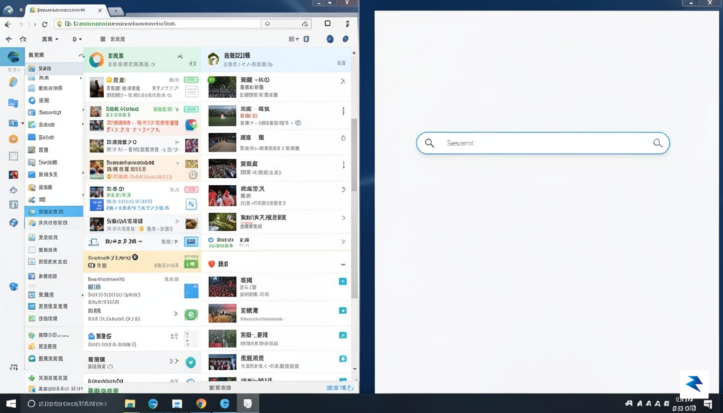
The most immediate observation upon opening the experimental Windows Search interface is the profound sense of calm that has returned to the desktop experience. For years, users have navigated a search panel cluttered with dynamic web content, promotional banners, and the often-intrusive “Recommended” section that prioritized cloud-based suggestions over personal files. In this new iteration, Microsoft has opted for a minimalist aesthetic that strips away these peripheral distractions, effectively decluttering the user interface. By removing the promotional widgets and the sprawling, algorithmically-driven content feed, the search window finally feels like a dedicated utility for your operating system rather than a marketing portal.
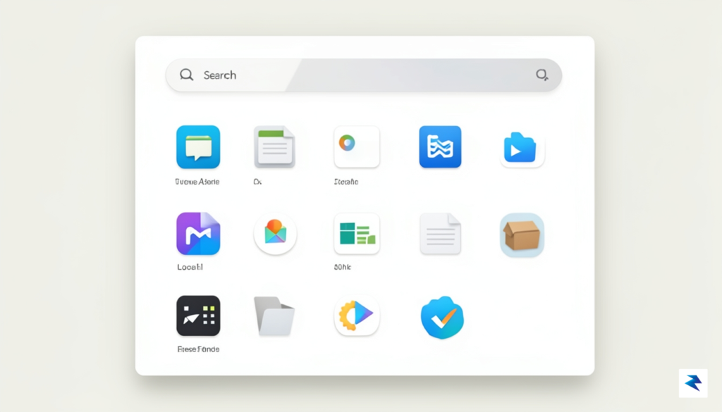
Functionally, this shift represents a return to the roots of what desktop search should be: a rapid, local indexing tool. Because the system is no longer spending precious processing cycles loading web-based advertisements or fetching personalized content suggestions, the search results appear with a newfound snappiness. Users will notice that the list of results is now dominated by local file directories, installed applications, and core system settings. This change in prioritization significantly reduces the cognitive load on the user, allowing them to find exactly what they are looking for without having to mentally filter through sponsored web links or irrelevant cloud-sourced “discoveries.”
The removal of non-essential UI elements turns the search bar back into a high-performance tool, prioritizing the speed and relevance of local system data above all else.
The layout itself has undergone a meaningful refinement to support this new focus. With the extra white space reclaimed from the removed promotional sections, the result list is now more spacious and easier to read at a glance. Text formatting for file paths and application names is clearer, and the iconography is better aligned to provide visual cues that aid in quick identification. Furthermore, the search bar feels more responsive to keyboard input, as the interface no longer needs to wait for external API calls to render the full panel contents. This streamlined architecture ensures that whether you are hunting for a deeply buried document or launching a specific system utility, the path from your keystrokes to the desired outcome is as short and unobstructed as possible.
Ultimately, this experimental build signals a potential pivot in Microsoft’s philosophy regarding the Windows ecosystem. By providing a clean, high-utility surface, the company is acknowledging that power users and casual enthusiasts alike value system integrity and performance over curated content feeds. It is a refreshing departure from the trend of “everything-in-the-search-bar,” proving that a more focused, stripped-back design can actually be far more productive than a feature-heavy one.

Beyond the obvious aesthetic improvements, a streamlined search interface acts as a vital engine for cognitive efficiency. When a user opens the search menu, they are typically in the middle of a workflow, looking to launch an application or locate a specific file. Every extra element—whether it is a promotional banner, a trending search query, or an intrusive web suggestion—acts as visual noise that forces the brain to filter out irrelevant information before focusing on the task at hand. By minimizing this “clutter,” the operating system reduces the user’s cognitive load, allowing them to maintain their flow state and complete their objectives with significantly less mental friction.
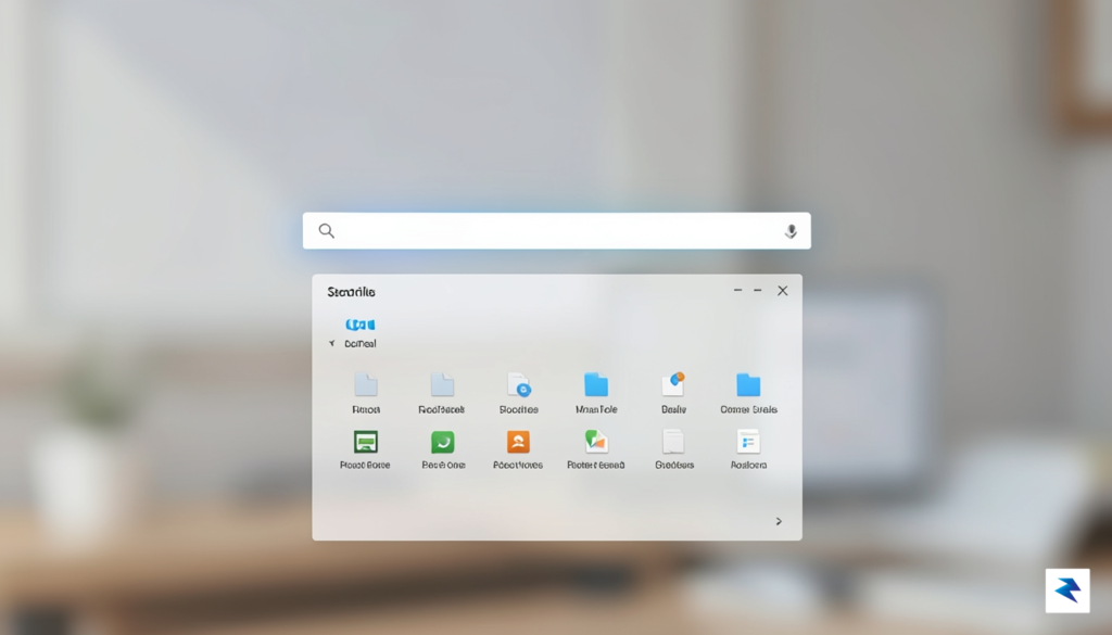
The technical implications of removing these extraneous elements are just as significant as the psychological benefits. Modern Windows search menus often rely on background scripts to fetch real-time web data, sponsored content, and dynamic previews. These processes consume system resources and introduce latency, often resulting in that frustrating “stutter” or delay when a user types a query. When the interface is stripped down to prioritize local indexing, the system can bypass unnecessary network requests and server-side lookups. This shift results in a noticeably snappier response time, ensuring that the search results appear near-instantaneously as the user types, rather than forcing them to wait for the interface to render secondary, non-essential data.
The true value of a search tool lies in its transparency and speed; when an interface stops trying to sell or suggest and starts simply serving, the user’s relationship with their machine shifts from reactive to proactive.
Ultimately, a focused search experience respects the user’s intent by placing local utility at the forefront of the interaction. By surfacing deep-system files, settings, and installed applications without the distraction of marketing fluff, the operating system functions as a high-performance tool rather than a billboard. This design philosophy acknowledges that the primary goal of any search menu is to act as a bridge between the user and their data. By streamlining the architecture, Microsoft is not just cleaning up pixels; they are optimizing the fundamental way we interact with our digital environments, ensuring that the technology stays out of the way of the work that actually matters.

For years, the evolution of the Windows desktop has felt like an increasingly crowded marketplace, where the operating system itself often competes with its own applications for the user’s attention. By embedding promotional content, suggested apps, and integrated web search fluff into core navigation areas, Microsoft inadvertently signaled that the OS was becoming a billboard rather than a utility. This shift has not gone unnoticed by a core user base that values efficiency, focus, and performance above all else. Consequently, the current initiative to strip back the intrusive elements of the Windows Search experience represents a significant strategic pivot, aimed at addressing the erosion of brand equity that occurs when a premium product begins to prioritize short-term engagement metrics over long-term user satisfaction.
The competitive landscape of modern computing has shifted, and users now have more viable alternatives than ever before. With the polished, distraction-free interfaces of macOS and the highly customizable, lightweight nature of various Linux distributions, Windows can no longer rely solely on market dominance to retain its professional-grade reputation. If Microsoft intends to remain the gold standard for enterprise and creative workflows, it must demonstrate a commitment to a “clean” environment where the OS stays out of the way of the user’s objectives. By testing a version of Search that prioritizes local files and genuine utility over ad-supported suggestions, the company is finally acknowledging that its true value proposition lies in reliability and seamless integration, not in intrusive marketing tactics.

Maintaining user loyalty in the modern era requires a shift from “attention-capture” models toward a “utility-first” philosophy, where the software empowers the user instead of seeking to distract them.
This move to simplify the interface should be viewed as an essential correction rather than a minor UI adjustment. When an operating system feels bloated, it erodes the sense of ownership and control that power users and IT professionals demand from their primary workstation. By actively listening to feedback and pruning the “fluff” that has cluttered the experience, Microsoft is making a deliberate choice to reinvest in the goodwill of its base. Ultimately, the success of this pivot will depend on whether this cleaner, more focused approach becomes the standard for all users, reinforcing the idea that Windows is a professional-grade platform designed to serve the needs of the individual, not the requirements of an advertising engine.

For those eager to experience a streamlined search interface, it is important to understand that this shift is currently exclusive to the Windows Insider program. Microsoft utilizes this platform to gauge how users interact with experimental interface changes before committing to a global rollout. If you are interested in testing these adjustments firsthand, you must enroll your device in the Windows Insider Program through the Settings menu under Windows Update. Once registered, selecting the Canary or Dev channels will grant you access to the latest, albeit less stable, builds where these features are being vetted. However, keep in mind that these experimental channels are intended for enthusiasts and developers; since these builds can contain bugs, it is highly recommended to use a secondary machine rather than your primary daily driver.
The timeline for these features reaching the general public depends entirely on the data gathered during this testing phase. Microsoft typically evaluates telemetry data and user sentiment over several months to determine if a design change improves usability or causes friction. If the feedback remains overwhelmingly positive, we could see these cleaner search results integrated into a “Moment” update or a major version release later in the year. Conversely, if the testing reveals that users prefer the existing integrated promotional content, Microsoft may pivot or offer a toggle switch, allowing users to customize the level of “fluff” they see in their daily workflow.
Your participation is the most effective tool for shaping the future of the Windows ecosystem. Providing specific, actionable feedback through the Feedback Hub is essential for ensuring that Microsoft prioritizes a clutter-free experience in the final stable build.
To ensure your voice is heard, you should actively utilize the Feedback Hub app pre-installed on every Windows machine. When you encounter the new search interface, take a moment to submit a report detailing what you appreciate about the reduced visual noise and whether it impacts your search speed or efficiency. Microsoft engineers monitor these submissions closely, and a clear, well-documented request for a cleaner UI carries significant weight when planning future software iterations. By staying informed through the official Windows Insider blog and engaging with the community, you can play a direct role in moving Windows 11 toward a more professional and user-centric search environment.
You must be logged in to post a comment.